
Kit Design Trends Defining the 2026/27 Season
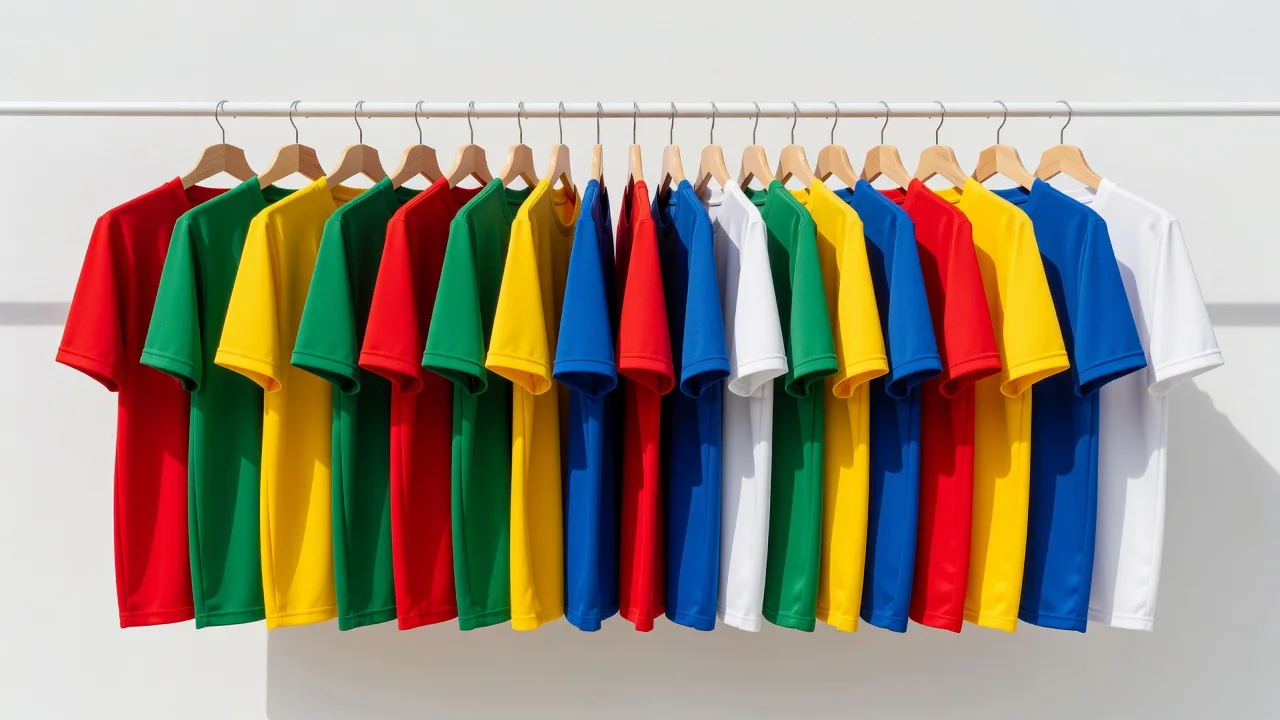
Every June the same ritual: teasers, leaks, launch films, and within a week a hundred new shirts across the big leagues. Strip away the campaign videos and the 2026/27 cycle has clear design currents running through it — some revived from the archives, some born of the manufacturing tech that now shapes what a shirt can even be. Whether you are buying this season's shirt or just trying to sound informed when it is unveiled, these are the trends doing the work.
The retro collar comeback
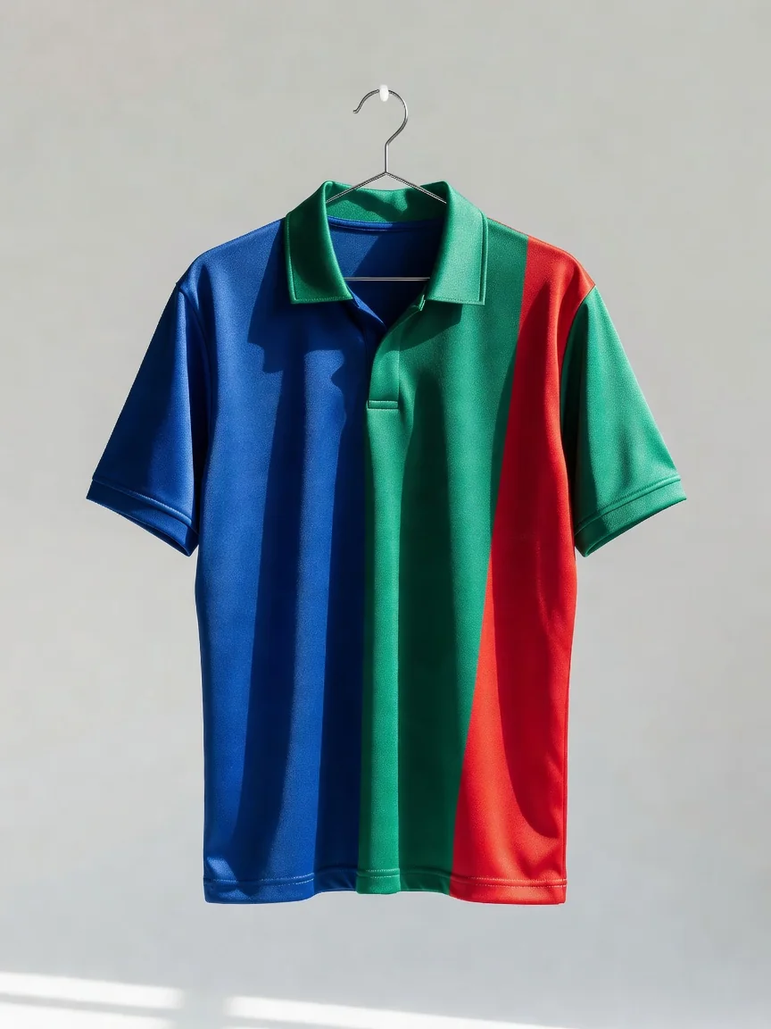
The loudest quiet trend of the cycle is the collar. After a decade dominated by crew necks and minimal v-necks, clubs across Europe's top flights have returned to structured collars — button plackets, polo folds, and the lace-up throwbacks that last appeared in the 1990s. It is not random nostalgia. The 1990s and early 2000s are the childhood of today's thirty-something kit buyer, the demographic with the most disposable income and the strongest emotional attachment to the shirts of that era. A collar photographs as "classic" in launch imagery in a way a crew neck never will.
Alongside collars come tonal crests: club badges rendered in a single colour, matched to the shirt, instead of full embroidery. Purists grumble; designers love it because it lets the shirt's pattern carry the identity while the badge whispers.
Sashes, hoops and the archive dive
The second current is pattern revival. Sashes — the diagonal band across the chest — have returned at multiple clubs whose history includes them, usually framed as an anniversary homage. Hoops and bold vertical stripes, sidelined for years in favour of gradients and abstract graphics, are back in first-team kits rather than just retro reissues. The mechanism is the archive: every major brand now maintains digitised catalogue history, and "inspired by the shirt of '94" is a design brief that writes itself and sells itself.
The genuinely new element is texture. Jacquard knits let designers weave patterns — tonal stripes, crest repeats, geographic motifs — directly into the fabric structure rather than printing on top. From the stands the shirt reads as one colour; up close it carries a second design entirely. It is the decade's most important manufacturing change showing up as an aesthetic one.
Why third kits went weird — and stayed there
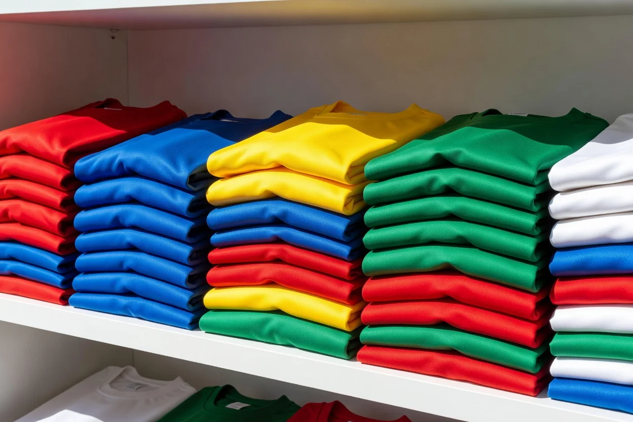
The third kit has completed its transformation from clash-avoidance spare to creative playground. With no heritage to honour and no traditionalist fanbase to appease, designers use the third shirt for the cycles' boldest ideas: neon colour stories, city-inspired graphics, cross-sport collaborations. Retail logic drives it — the home shirt sells to everyone, but a striking third kit creates a second purchase from fans who already own the first two. A season where the third shirt outsells the away is now common at big clubs, and launches are scheduled accordingly: home in June, away in July, third in August, each with its own campaign beat.
| Trend | Where it shows | What's driving it |
|---|---|---|
| Structured collars | Home kits across top leagues | 90s nostalgia of the core buyer |
| Tonal crests | Home and third kits | Pattern-first design language |
| Sash and hoop revivals | Anniversary home kits | Digitised club archives |
| Jacquard woven textures | Authentic-tier shirts | Knit technology, not print |
| Statement third kits | August launches | Second-purchase retail economics |
How to read a launch like a pro
Three questions cut through any launch film. First: is the pattern printed or woven? Woven jacquard marks the premium tier. Second: what is the collar doing? It tells you which decade the design is flirting with. Third: what story is the third kit telling? That is where the brand shows its actual ambition for the year. Answer those three and you have read the season.
Related reviews
Replica vs Authentic Shirts: The Real Differences
Same badge, two different garments. Fit, fabric, heat-applied details and durability — what the authentic version really adds for the extra money.
2026-08-31
How Modern Kit Fabrics Keep Players Cool
Jacquard knits, mesh zones, recycled polyester and sweat mapping. What the fabric labels on a 2026 shirt actually mean for heat and comfort.
2026-08-26
Home, Away, Third: Why Clubs Need Three Kits
Colour clashes, broadcast contrast rules and a retail calendar. Why the modern club launches three shirts a season and what each one is for.
2026-08-15